
Quick answer
A static ad is one image built to stop a scroll and sell one idea. A good one has a clear hook, one product detail, one reason to believe, and one next step, sized for the placement it runs in. For an e-commerce owner, it is the fastest and cheapest creative to test, and the same idea can carry into Amazon listing images, A+ Content, email and your product page.
Key takeaways
- Creative is the biggest lever you control. Nielsen's analysis of nearly 500 FMCG campaigns put about 47% of sales lift on creative quality and messaging, more than reach or targeting.
- One static ad, one idea. Hook, one product detail, one proof point, one call to action.
- Size for the placement. 4:5 for Facebook Feed, 1:1 or 4:5 for Instagram Feed, 9:16 for Stories and Reels.
- Variety beats volume. Meta's current system rewards genuinely different ads, not the same ad with a new color.
- Amazon plays by different rules. Basic A+ Content can lift sales by up to 8%, per Amazon, but the main image must be plain white with no text.
- Start this week. One product, three angles, five static ads, one winner.
What is a static ad, and why do they still matter?
A static ad is a single image, with or without a few words, that sells one idea. No motion, no sound, no second chances. That limit is exactly why it works.
My first ads had to catch someone walking down a supermarket aisle. Today they have to catch a thumb. The job has not changed: if someone gives this one second, what should they see?
Static ads still earn their place for four reasons:
- They are fast. One product detail, one designer, one day. You can test five angles before a single video is edited.
- They are cheap to get wrong. Low production cost means you can throw out the losers without a post-mortem.
- They travel. One idea becomes a feed ad, a Story, an Amazon gallery image, an email header and a product page banner.
- Creative does the heavy lifting. In Nielsen Catalina Solutions' analysis of nearly 500 FMCG campaigns, creative quality and messaging drove 47% of sales lift, while targeting drove 9%. That data is from 2016 to early 2017 and covers packaged goods, so read it as a direction, not a promise for your store. My read: an hour spent on the ad usually beats an hour spent on another audience setting.
If you want the full service view, see static ad design for e-commerce.
What goes into a good static ad design?
Seven parts. Miss one and the ad usually gives itself away.
| Part | Its job | Quick test |
|---|---|---|
| Hook | Give a reason to stop | Can you read it at arm's length on a phone? |
| Hero visual | Show the product, or one detail, doing something | Does the ad still make sense with the text covered? |
| Proof | Give a reason to believe: a review, a number, a comparison | Is it real and specific? |
| Offer | Say what they get, in plain words | One offer per ad |
| Call to action | Tell them the next step | One verb, one button |
| Brand cue | Make it recognizably yours | Do logo and color show without crowding the product? |
| Format and safe zones | Keep text clear of crops and app buttons | Preview it in every placement |
The one-second test. Show the ad to someone for one second, then hide it and ask what they remember. If it is not your product and your main reason to care, simplify.
Two cautions. Proof has to be real: use actual reviews, actual numbers, actual comparisons. And leave out claims you cannot back up. Amazon's own A+ guidelines, for instance, rule out claims like "best-selling" and "top-rated", and that is a good habit for any ad.
Which sizes does an e-commerce brand need?
Start with Meta, because one set of sizes covers Facebook and Instagram. Sizes below follow Meta's published specs and Hootsuite's summary of them; Meta changes these now and then, so check Ads Manager before you export.
| Placement | Ratio | Size to design at | Watch out for |
|---|---|---|---|
| Facebook Feed | 4:5 | 1080 x 1350 px (1440 x 1800 px recommended) | Keep text short; it is read on a phone |
| Instagram Feed | 1:1 recommended, 4:5 supported | 1080 x 1080 px or 1080 x 1350 px | Anything taller than 4:5 is cropped to 4:5; minimum 600 px wide |
| Stories and Reels | 9:16 | 1080 x 1920 px (1440 x 2560 px also works) | Keep key content centered; leave about 250 px clear at top and bottom for overlays |
| Carousel | 1:1 or 4:5 | 1080 x 1080 px or 1080 x 1350 px | Each card should work alone and as part of the set |
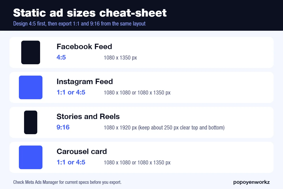
My working rule: design the 4:5 version first, then build the 1:1 and 9:16 from the same layout with the product kept in the safe center. One layout, three exports, no re-thinking.
How do static ads connect to Amazon A+?
Same discipline, different rules. A static ad and an Amazon image both have to say one thing quickly, but Amazon controls what you can put in the frame.
What A+ Content is. It is the enhanced product-description area on Amazon. You need a Professional seller account and Brand Registry. Basic A+ allows up to 5 modules and Premium up to 7. Amazon says A+ can lift sales by up to 8% (Basic) and up to 20% (Premium), based on Amazon internal data. Treat that as Amazon's claim, not a forecast for your listing.
Main image rules. Pure white background (RGB 255, 255, 255), no text, logos or props, and the product filling at least 85% of the frame. Aim for 1600 px or more on the longest side; 1000 px is the minimum for zoom.
A+ rules. Do not bake text into images, and keep pricing, promo and shipping details, QR codes and links out. Module dimensions come from third-party guides (for example Header Image 970 x 600 and Image and Light Text Overlay 970 x 300), so confirm the exact size in A+ Content Manager before you export.
| Meta static ad | Amazon main image | A+ module image | |
|---|---|---|---|
| Job | Stop the scroll | Win the click from search | Convince on the product page |
| Background | Anything on-brand | Pure white | On-brand, no promo claims |
| Text in image | Short hook is fine | None | Avoid; use the text fields |
| Offer and price | Allowed | Not allowed | Not allowed |
| Typical size | 1080 x 1350 px | 1600 px or more | Per module, check Content Manager |
One product detail, many surfaces. Pick the strongest detail, such as a material, a result or a before and after. Show it in the Meta ad with a hook, in an A+ module with the claim moved into text fields, and in an email header. The idea stays the same; only the rules around it change.
What can a business owner do this week?
You do not need a big budget or a brand overhaul. You need one product and a few days.
- Pick one product. Your best seller or the one with the best margin.
- Write three angles. For example: the problem it solves, the result it gives, and how it compares with the alternative.
- Make five static ads. Two or three visuals per angle, with one idea each. Use the table above for the parts.
- Run an even-budget test. Same audience, same budget per ad, for a few days.
- Read two numbers. Click-through rate and cost per purchase. Ignore the rest until you have a leader.
- Reuse the winner. Crop it to 9:16 for Stories, rebuild it as an A+ module, and use it as an email header.
- Replace the loser. Keep the angle that lost only if you think the execution was the problem.
If you would rather hand this off, that is what my static ad design service is for, and the AI ad creative guide shows how I speed up the testing.
How do you test static ads without wasting budget?
Change the idea, not just the color. Meta's current delivery system, often called Andromeda, rewards creative variety. Dentsu's guidance puts it bluntly: duplicating ads with small edits is no longer enough. Jon Loomer's advice is to mix videos, static images and carousels, with each one distinctly different from the others. Both are listed in Sources.
In practice:
- Vary the angle. Problem, result, comparison, gift, routine.
- Vary the proof. Review, number, before and after, expert line.
- Vary the look. Close-up, lifestyle, flat lay, bold type on color.
- Keep a control. One ad you do not touch, so you know whether the new ones are actually better.
- Cap the batch. Five to six ads is enough to learn from without spreading the budget thin.
Frequently asked questions
Are static ads still worth it in 2026?
Yes. They are the cheapest way to test an idea, and the winning idea can later be turned into video, an A+ module or an email header.
How many static ads should I start with?
Five or six, covering different angles. Fewer gives you little to learn from; more spreads a small budget too thin.
What size should my static ads be?
Design at 1080 x 1350 px (4:5) first, then export 1:1 and 9:16 versions. Check Meta's current specs before you upload.
Can I reuse my Meta ads on Amazon?
Not as they are. Amazon's main image needs a pure white background with no text, and A+ images should not carry pricing, promo claims or text baked into the image. Reuse the idea and the product detail, not the file.
Do I need Brand Registry for A+ Content?
Yes. A+ Content needs a Professional seller account and Brand Registry.
Sources
- Nielsen Catalina Solutions, FMCG campaign analysis (nearly 500 campaigns, 2016 to Q1 2017)
- MarketingCharts: what drives sales lift (Oct 18, 2017)
- Amazon: A+ Content overview
- Amazon: A+ Content design guide
- Meta and Instagram: ad media requirements
- Hootsuite: Facebook ad sizes
- Jungle Scout: Amazon image requirements
- Soona: Amazon A+ content sizes
- Jon Loomer: Andromeda and creative diversification
- Dentsu: Andromeda strategy
Platform specs change often. Recheck them on the platform's own page before you publish or export.